Tuesday, December 15, 2015

Moma Museum Visit


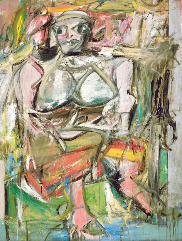
This artwork by William de Kooning is a painting done in the time period of 1950-52, entitled "Woman, I." In the Moma blurb, it states that this painting "reflects the age-old cultural ambivalence between reverence for and fear of the power of the feminine." I chose this because the topic of exploiting women within artwork was brought up during class this semester. This topic was interesting to me because not only was it a popular topic back in the older days, but currently as well. The infatuation with a woman's body has always been the main focus that is exaggerated upon within artwork that contains a female. The purpose of paintings like these was to make an extraordinary version of the ordinary woman. The blurb would describe the context of the art piece. As for the objective content of the painting, Kooning chose to make the most obvious features the breasts, face, shoulders, and feet. These features have the most geometrically shaped forms, appose to the rest of the painting that contains shapes that are more organic. If it wasn't for this class, I wouldn't even understand terms like the ones I have mentioned. Also, I definitely would pay attention to specific features within artwork. If I were to see this, let's say, last year, I would simply see a painting that seemed to be a supposed woman, but was poorly painted. As for now, I see the body of a woman being cut apart to insinuate her most prominent body features. These days, the attention drawn upon a woman isn't as vaguely interpreted as this painting. Currently we are used to seeing more modernized art that is done with the use of cameras. Although the tools change, the focus remains the same.

Semana Santa

This painting I couldnt quite find the name for was my favorite from my museum trip with a friend. I went back to a museum that i went to years before that is in my neighborhood its called Hispanic Society of America. The place is easily missed and passed by because its within a small college called Boriqua college. It looks ordinary from the outside but once you enter its a whole different world. The museum is beautiful down to the architect and moldings on the walls, there is a elegant spiral staircase in the museum that you can imagine a girl with a long trained dress walking down it.
The painting is made of oil on canvas and in the foreground there are figures wearing chronicle hoods marching through a crowd with a shrine to Mother Mary in the background.
Two years ago this painting called out to most when i had writers block. My mentor took me here and said "Pick your favorite painting in here and lets make a story out of it."
Eventually we came across this painting that sits perched up high on a wall. Immediately i thought to myself maybe i can work with this. We later on researched the time period that the painting was indicating and found out that this was during the Holy week in Spain.
Though the history of this event is very detailed its interesting. These people dressed in chronicle hoods walked the roads between the towns of Seville and Bellavista. This event called Semana Santa "Holy week" was established during the late 1500s and early 1600s and so that is the time period my story is set in.
During this class my interest in museums have been brought out, before this class i have only went to museums just as class trips now im making plans to go to new ones and exploring more. This class was one of my favorites because we explored different kinds of artworks, some i didn't like but others i did and we got to choose our own way to show our inner creativeness with the 2nd to last blog post.

Ultimate BP (#10)

Being born and growing up in NYC, you often forget how much free and low cost access we have to all forms of art. What I loved especially about this class is that I received constant reminders. Before going to the MoMA this past Wednesday for this particular assignment, I hadn't been in years (approximately 8 years). I marveled at so many of the pieces and already (mentally) scheduled another visit that I'd take my little cousins along for soon. The depth of my understanding, knowledgeability and enjoyment of art has also deepened in the past four months. It's like seeing art with newly heightened awareness, appreciation and, at the same time, discerning view. Much like psychology students who feel they can do psych evaluations after a semester of studies, I've left feeling like I can curate for a gallery already! But seriously, I do have an even greater interest in the visual art world. 

Roberto Matta is described as using "spontaneous, unplanned 'automatic' drawing." Automatism is defined as the avoidance of conscious intention in producing works of art, especially by using mechanical techniques or subconscious associations. This definitely came across in "The Vertigo of Eros." This falls within the realm of surrealist art.  

This two dimensional, oil on canvas painting by Chilean artist Roberto Matta consist of many geometric shapes and lines painted on top of organic forms. Those organic shapes appear to be rippling water, stone-like figures, simplified human-like figures and other figures that are less obvious and harder to recognize. In regards to value, there isn't a great deal of contrast. There are areas of yellow however most of those are shaded with black and dark hues. Besides the dark, black hues in the painting, there are the analogous warm tones of red and (mostly) yellow. Matta created implied texture of prisms with his placement of lines and geometric shapes. He gave depth to the art of work. He called this an "inscape" and projection of his psyche. This work is dream-like, abstract. It evokes a quiet confusion and energy. Due to the palate used, I'd assume most would say that this glimpse into his psyche reflects a nightmare but I get passion and animation. "Vertigo of Eros" has a lot of movement. I knew Eros was a Greek god associated with Aphrodite and whose roman counterpart is Cupid. Upon quick research, I found out that he was also a mischievous god whose and child of chaos. It explains the intensity I felt when immediately seeing this Matta painting.

Not only did I find an amazing piece but I learned about another style of art (automatism), within a well known art movement (surrealism), that I've never before even heard of.


    Artist: Roberto Matta
    Dimensions6′ 5″ x 8′ 3″
    Created1944
    MediaOil paint

Final


          The museum I attended is the Museum Of Modern Art (MOMA) and I decided to choose is called the Piet Mondrian created by the Dutch in 1872-1944. This is a series of painting together with four in total and created by different artists. The first painting to the left is a painting that has many rectangular shapes to create this piece of art and it was done by John L. Senior, Jr in 1957. It was a artwork done by two people, father and son working together to create this oil on canvas shapes. Second painting is a artwork with just four lines shaped into a rectangular shape. It is created by Katherine S. Dreier Bequest in 1953 using oil painting on canvas. The third painting is with the same rectangular shape as the first painting with fewer colors, just red and blue. This work of art is created by Philip Johnson in 1942 using oil on canvas. This painting is different from the rest because it was first painted in 1929 by Mondrian and later on repainted by mistake. Last painting is a little more complex then the other with the combination of all painting. It has the same rectangular shape with lines across it with the colors red, blue, and yellow. It is a oil on canvas created by The Sidney and Harriet Janis Collection in 1967. These four painting is about showing how simple but yet creative with the shapes the artists decide to use. Out of the whole museum, this works of art is my favorite because of how simple and nice it is too look at. When I was exploring MOMA, I wanted to do this project on artwork at I personally would have in my house. I saw this painting and instantly liked it because of how clean and simple it was, it wasn't confusing like the other painting where you had to look at it for a long time to see its creativity.

          This class definitely helped me to enjoy art a little more and learned how to view art in a more detailed way. Even though I don't like all the works of art in museums, there are some few that catch my interest. Before I would just walk around museums looking at the same thing over and over again but now I go around the whole place to see what they offer. Art and Society is the first art class that I have taken since middle school and I enjoyed it a lot learning about different artists and different types of art. I also learned that everyone is creative even when they say they aren't because everyone has imagination that they can use for art. 

Final Post BP 10


Lele Saveri
Italian, born 1980
The Newsstand 2013-14
Mixed-Medium installation

This artwork is by far the most eccentric and interesting pieces I saw at the MoMA on Wednesday, December 9th. It is named ‘The Newsstand’ and is made by Lele Saveri. There are many interesting aspects and even productive activities that also occurs at the Newsstand. Everyday, from 13:00 - 16:00, there is a merchant that even sells some of the items and artwork that inside of the stand. The items are just small products made by Saveri, such as pens, postcards with abstract designs, t-shirts, photographic events, etc. I liked what Saveri did here because this really reflects on the artistry that an urban New Yorker would create. There was categories of magazines posted up such as the news, adult rated content, postcards, to even photographs of New York icons. Some of the New York icons that I manage to depict was the famous movie director Spike Lee, New York Knicks basketball star Carmelo Anthony, and Queens native professional basketball player Ron Artest. Not to even miss out, there was even vinyl covers and album covers of today’s hottest artists. It was clever because each artist that was posted up made a huge impact on New York City (Nas, Fabolous, etc.) This is supposed to tribute the Lorimer Street/Metropolitan Avenue subway station that connects the L and G trains. The Newsstand made me literally want to visit that station and see the similarities and differences that could be the real stand. Next time when I take my visit to the MoMa, I’ll make sure I go between 13:00 - 14:00 to purchase a souvenir in The Newsstand.

Final post


Artist name; Kevin Beasley
Untitled
Materials; house dresses, resin, soil, and television Mount
Museum; MoMA


The artwork that I selected was a sculpture titled "Untitled" by Kevin Beasley. The mediums used were house dresses, resin, soil, and a television Mount. The variety of colors is what caught my attention. When I saw this I thought of the four seasons. The bright and orange represents fall. The purple with what looks like mint green represents spring. The blue is winter and the green with light blue is summer. On the left side almost where the middle is there's black with red circles. That reminded me of the night sky and those red orbs were the twinkling stars that lid the night. The artist's choice of materials was interesting to me because he used clothing. At first glance I believed it was some sort of paint but when I got closer I was wrong. I didn't know what this was until I read the caption.
After being in this class, I've learned how to view paintings and sculptures differently. Normally I would of been a passive observer however after taking this class I can't help but apply what we've learned in class every time I look at something artistic. This course was my favorite. I've never posted a blog a before nor have I ever been in a cluster in which all courses shared many themes and topics that could relate to another class we're taking. It was interesting but a bit challenging. Overall, I had a great time and hopefully I still am involved with art as it's a way to express myself other than writing. ☺☺

POST #10


Artist= Zhang Hongtu
Pingling, China, born 1943
"A walking man" 1984
Acrylic on canvas


On December 9th, for the final blog post I visited Queens Museum. I picked this work of art "A walking man"(1984) by Chinese artist name Zhang Hongtun. I found this work of art very unique because of the color that he used because it's neither primary nor secondary. The medium of this work of art is acrylic paint and canvas. Since, it is acrylic on canvas it lies in 2d category. It is very hard to see what is in the painting due to the very dark colors. Hongtun has used so thick layers of paint, so the texture of painting is not a plane as most 2D work of arts has. In the far background, there is a tree, in the left middle ground, there is fish taking out his the head from the water and looking at the back of the man, and in the foreground there a man walking, facing in front. He tried to capture the very dark and depressing feeling in this painting. This is a representational work of art to me because, he tried to depict himself in the painting. And according to the content, the painter being from China felt very weird from all the cultural shock and found himself in a very weird environment when he came to America and was an inspiration for him to paint this particular piece. As the topic suggests walking man and fish he must have felt as if he was the only human and couldn't really communicate with others or feel comfortable speaking, even when they are, He used only cold and thick layers of dark colors hinting that it was very hard, lonely, having a hard time blending in the society and sad being in this sort of environment away from his home, friends and family. Finally, I guess he made this work of art, to convey his feelings and emotion while living in a different place and also it is kinda related to me. therefore, I chose this work.
After taking this class visiting the Queens museum was very interesting and knowledgeable to me because due to this class I started looking at artwork in a different way, for example, what is the artist trying to convey or appeal a message, feeling and emotion to us. Most importantly, I learned that art is life because we are surrounded by art and it is everywhere.

Monday, December 14, 2015

Finale Post

 
For the Finale of Art & Society Museum trips, i decided to got to the Queens Museum. I choose this art piece from Zhang Hongtu because it stuck out to me the most from the rest of his works. Four trees in foreground in the oil on canvas made me think of my family when i first saw it. the two taller trees being parents. the small twisted looking tree in the middle being my twisted younger sister and the tall tree on the far left being me. there is also a lot going on in the painting, for starters, the bottom of the painting features predominatlty warm colors and the top is made up of cool colors. the trees are settled on a large rock that is covered with green leaves. there is overlapping, the land in the back of the tree has a place for shelter/shade on the right side of the foreground. the background, aka the mountain area, was painted with diagonal lines. it looks as if it is going to crash down of something, which i thought was very cool. the middle ground, is of a small lan mass with trees. i feel as if Zhang Hongtu painted the bottom of the paintinf during the day because when i look at it, i think the sun is shining, but when i look above, its very cloudly and dark. When I first came to your class, i was ready to change majors, quickly and without a question. I had not been into art since elementary school, I had the sketch books and everything (my parents thought i could make something of myself with it). But then i had no choice but to stay, my laziness got the better of me, for the better. Quickly, i began to realize again why i was so into art and how it never really left me, i just turned it into editing. i learned a lot of things from your class, like going to museum frequently is not a rich persons thing, learned the notes you gave us in class. i also learned how powerful art can be in this world. i also see things a lot differently now as well, its not just liking a picture anymore, its why it was made, how. and what is really going on it for me. Your class has been the best part of my first semester in college.

queens museum

Queens museum: Zhang Hongtu
I choose this artist because i thought his artwork would be interesting to look into and was. One of the artworks he did that spoke out to me was a sculpture of coca-cola bottles that were covered in porcelain. The name of this artwork was called "Kekou-kele", which translates to coca-cola six pack. It was made in 2002.  There six bottles in total.The bottles are small in size, The bottle caps were on the left foreground of the soda bottles. Soda bottles are usually plastic with red or black label that is made of paper. These bottles are have a blue and white color with a flower pattern. My implication of the texture is hard because porcelain has a hard glass texture. The caps are also covered in a white and blue porcelain. They don't have a flower pattern, instead they have symbols.
  
Zhang Hontu's artworks convey the political ideas between New York and China.

BlogPost#10/Final


Artist: Steward Uoo (b. 1985)
Artwork: Untitled (Versace/ H&M small white), 2015
Artwork: Untitled (Hollister small white), 2015
Materials: Cotton, shopping bags, flies (Calliphora vomitoria), cockroaches (Periplaneta americana), pigeon (Columba livia), feathers, pigment, polyurethane resin, synthetic fibers, dust.

These two works of art display a multiple use of materials that are mixed together using “techniques similar to those of traditional paper fabrication”. The whole display includes two separate pieces that combine to represent one. The artist creates two versions of this type of  artwork both named untitled but with parenthesis around it to describe it better. One set has ‘small white’ after the name of the brands inside the parenthesis while the other says ‘medium black’ and ‘medium gray’ after a different set of brands for the work piece. I liked both but i choose to focus on the white version because the ease in which the materials can be seen. But both include the same materials. I choose this artwork because it deals with a topic i can agree with, which comes from the description in the museum of why the artist made this and how he got inspired. “Uoo first became interested in shopping bags as an artistic material when he observed two female impersonators exiting a taxi, their arms laden with glossy paper bags bearing the logos of various luxury brands. Inspired by the way the shopping bags instantly communicate the desire for a particular lifestyle of indulgence, Uoo repurposes them to invoke an aesthetic closer to what he describes as ‘curbside garbage’”. It is because of his desire to covey a strong message that really captures my attention because it is something that is very relatable and i feel the same towards. Also the use of materials are very unique and intriguing. After taking this class going to a museum feels like a fancy treat. I feel like I have to know what materials were used. And I wonder what their purpose was in doing what they did,which is difficult to figure out sometimes because sometimes the their isn’t a description for the work of art being displayed. Art seems more mysterious and meaningful than simply to be pretty and/ or labeled as weird. During this semester I learned that art is everywhere and not only in museums, but also in almost everything. And that it can carry a purpose behind it or it can be simply done to capture and/ or recreate beauty.
   On December 9th, 2015, me and a couple of my classmates, decided to take a trip to MoMA. To be honest, finding a piece of art work that I actually liked was very tricky for me considering I'm not really a big fan of modern art. After walking through the entire museum and only seeing a             couple pieces that I liked, I finally stumbled across the Ocean images: New photography gallery. In the gallery, you're greeted by a video of a man in a wig and make-up moving in slow motion, smiling and looking very intensely into the camera. Automatically I knew I would like this section. Almost every piece that I looked at I loved. Down to the security guard who jokingly told me that I would be able to take home one of the pieces I was looking at, for free. Out of all the amazing artists that I could've chosen, I choose Lieko Shiga. Shiga decided to do a series of stills titled "Rasen Kaigan" that bordered the line of offensive and beautiful. What caught my eye is the use of color, and value. Definitely the big thing that Shiga decided to play with was how dark and light she could get the photos to specify how important     the colors are. According to the wall label, "Shiga moved to the Japanese village of Kitakarna, she became its resident photographer, documenting events in the region and collaborating with it's inhabitants. Rasen Kaigan (Spiral Coast) is a series of 250 dramatic images (eleven of which are seen here), show before, after, and during the 2011 Tohoku tsunami that battered Japan's coast. BUt the series is not documentary in the traditional way. Shiga uses filters and blatantly manipulates the negatives, creating vivid and ghostly scenes: a man who seems to be impaled by a tree; a woman with a bike careens down an impossible ravine; a birds eye view of the earth reveals scrapes and scars; hands reach towards a limp female body. Shiga tells the history of the land through the bodies of her neighbors, nature and humanity linked in life and death." To Shiga, her best way to document the tragic event is to use her photography. The decision to try to make the works seem so ominous is probably one of the best uses of filters that I've ever seen. She really is something special. 
     During this class I've learned that art is so much more than just a picture in a frame. It has emotions of its own and it has layers on top of layers that need to be peeled before you really understand what it's about. I've learned so much about the effect that light and dark have on a photo, or that what you chose to title your work could have a huge impact on the meaning of the piece. All in all, this class was by far my favorite class that I've taken this semester. 

10


Gustav Klimt
Adele Bloch- BauerII, 1912
Oil on Canvas
Private Collection
MoMa Museum

This painting is by Gustav Klimt, the mediums done in oil paint, as well as style is a portrait. But it is not realistic. Textures upon this canvas are extremely soft and delicate. The variations of value and colors range. The colors are a mix of cool and warm hues, but they are not your typical colors, that is where values come into play. The composition of this painting is very playful, in the sense that there is a lot of movement of the objects around the woman, even though she is very still and prominent in the foreground. 
 I had chosen this art piece because I though it was stunning in the color composition, as well as the natural "elements" added. This piece is both intelligent yet elegant. Why? The woman in the foreground has a very strong face, but as well as her attire is very profound and unique. As for the background instead of this being such a serious portrait it is vibrant and exuberant in its colors and objective choice in flowers. Observing this particular art piece i felt a type of emotional relief, in the sense that the woman is taking a breath in her "uptight life". What had stood out the most to me in all was just the background. It literally almost fuzes with the foreground figure in the color composition. For a painting that it done in 1912 i felt like this was not your typical painting. It is very loose and giving to the viewer, where you can play with your imagination a lot more. But it is also almost very traditional because of the victorian woman. I felt relived, and was struck by its colorful beauty.
  This is not the first time for me attending the MoMa Museum. At first I was not really dazzled by the certain exhibitions being shown because it had involved a lot of technology. But once i had went to more of the older exhibitions, that were considered of "Modern Art" I felt like this was more appropriate to the name. From taking Art Society this semester, it was truly an exciting class. When i go to different art museums i do definitely see different ways to a approach a painting in ways that the artist himself would like me to view it. In Art Society I learned most importantly how vital art is to society. Without it people would not be able to have a voice or make an impact upon their own community. As a young artist it had truly inspired me to create my own work to reflect how I view society and what should be changed, and what should be done. Hopefully the art community can gather more often and support the general community itself. It was a blessing being in this coarse as well as one of my favorite courses. It made me think, feel enthused about learning more about the art community. 

Blog post 10


Jackson Pollock
One: Number 31,1950
Oil on enamel paint on canvas
8'10x 17' 5 5/8
MoMa Museum

  This art piece by Jackson Pollock was part of an exhibition in the MOMA Museum. The title of this painting is One: No. 31. In this series of abstract paintings  this was one of the largest pieces. A long with  in the exhibition there were 50 paintings,  drawings and prints in the collection.  In particular to the painting is featured more towards figurative, mythical, and primeval themes.
 The style of this painting  is abstract and the mediums in order to make this piece is oil on enamel paint, on canvas.  There are some patterns in a way, which is used with color, and as for texture it is very rough. The layers are done by globs of solid paint splattered across the canvas. The different hues of black, green and white are very prominent; in the sense  that if you look at each individual color in how the effect the canvas and you eye, it stands out in a pattern. The yellow background definitely adds to how you view the splatter paint, in the sense that it makes the hues stand out. There are no values. From an emotional response, I feel as this were static almost, or different nerves all jumping out at me in adrenaline. But eventually if you follow the lines to me there is a type of smoothness. Since the paint is not necessarily pressed upon the canvas that is where the rough texture stands.
 I had chosen  this particular piece from Jackson Pollock because I always look at refined art and portraits. But this time I really wanted to step out of my comfort zone and choose something that spoke to me emotionally from the artist. I have seen Jackson Pollock's art before online and I was instantly  fascinated because, I had found it extremely sophisticated for abstract art. It was very simple in its color composition, but it screamed in its technique, emotion.
 Visiting the MoMa for the first time at first I was not completely enthralled but eventually it came to from on me once I had entered the "Modern" section of paintings. Also the exhibition of Jackson Pollock, that was the whole reason why i decided to go to the MOMA.
  From what this coarse has taught me I definitely see art in a more professional view. Meaning I understand content, emotion, message, and the composition of an art piece. Art Society definitely exposed me to how in general the "art society" from the past and until now is like. It is extremely controversial, rebellious, liberal, and not so liberal. Art Society had inspired me to make a difference in the Art culture itself, like the Gorilla Girls. I want in all female artists to be known and shared more in exhibits. They deserve that privilege like anybody else in the art world.

Blog Post #10

Zhang Hongtu
Pingliang, China, 1943
Anonymous(song)- Van Gogh P, 2013
Oil on canvas
Private Collection

The artwork I have chosen for the last blog post is a painting within the Queens Museum by Zhang Hongtu (1943) entitled "anonymous (song)- Van Gogh P". The canvas includes a landscape but the scenery being limited within a circle. The circle may have been used as a window as well emphasizing the objects in nature same as Van Gogh's "The Starry Night" canvas. A combination of Van Gogh's painting along with Hongtu's selected landscape from China. Hongtu uses cool and warm tones as Van Gogh's technique of brushstrokes. In the foreground on the bottom right holds a small scale of tree's with a combination of brown and orange leaves close to the edge of the cliff. Going down the cliff to the left involves a trail of rocks with a tree or a shrub peeking out. Disconnecting from land includes a body of water. Hongtu uses the paintbrush to go criss-cross depicting the movement of the water around the rocks. The chaotic waves clashing against the large rocks, the rocks are positioned in order from the smallest rock to the tallest as if it reached the sky. The background illustrates the same setting as Van Gogh's painting. A large yellow moon and star in the sky with brushstrokes surrounding them as if they were illuminating along with three faded stars scattered around behind the curved cloud. Outside the frame on the bottom right consists of Chinese writing that may be lyrics as said on the label.
The reason I chose this artwork by Zhang Hongtu is the way he used a style by a western artist Vincent Van Gogh along with Hongtu's own presentation of his native land. By the looks of it Hongtu may be influenced by Van Gogh, "The Starry Night" is a popular painting and with Hongtu's own personal twist is interesting, a hint of a previous painting and a landscape from China. Before enrolling into this course, Art and Society, I wasn't as interested in art or if I did get a chance to go to a museum I'd just glance by each exhibit. With the assignments given, art is everywhere it can be accidental or the way one interprets an object to just giving something a meaning. Sine the course is over I do appreciate art. i look forward to visiting other museums and i'll feel prepared or cultural and given someone my own interpretation on an exhibit. Also, I became interested in other artists for instance Zhang Hongtu and Henri Matisse. Further in the future I want to experience artist's I haven't heard of or learn more about the person. 

Thursday, December 10, 2015

BP #10


The artwork I selected for my final blogpost is a painting I found at the Museum of Modern Art entitled "The Sleeping Gypsy" (1897) by the French artist Henri Rousseau. Rousseau uses cool colors and horizontal lines to give a calm, warm and relaxed appearance to the painting. 
The use of monochromatic color gives this painting the appearance of a warm, calm summer night. The dark blue and black of the sky contrasts with the dark brown color of the sand. The sky and sand create the negative space in this painting and the majority of this canvas is taken up by it. The dominant objects at the center of this painting are the gypsy woman who has bedded down for the night in the dessert with a guitar and vase lying next to her, and a lion who appears to be passing by. The darkness of the sky and the lions mane is contrasted with the brightness of the moon and the lions eye. Generally, when one thinks of a lion interacting with a human, we think of violence, the lion attacking the human but in this painting Rousseau use of color and calm horizontal lines gives this painting a peaceful and tranquil. feel.
I chose this artwork out of the many beautiful pieces in the MOMA painting gallery because the colors really made it stand out. There's something about the overall calmness of this painting that really drew me to it, the use of dark colors to invoke tranquility in the night when the night is usually considered something to fear. I also read that Rousseau was never able to enroll into art school in Paris despite many attempts. That was also a huge factor in my enjoyment of this artwork, if Rousseau can paint something this incredible with little formal art training than I believe it is possible for anybody to do something similar using their natural talents.
The visit to MOMA yesterday was my second since I started this class, early on in the semester, being constantly shown various works of art had already had its influence on me. I felt a need to spend more time in the various museums I have access to living in this city. Not taking advantage of that would be a huge loss. Although I feel that learning the various technical terms to describe art didn't change how I appreciate it, learning the background and history of art an artists certainly has. 

Wednesday, December 2, 2015

Consciousness Monument (Model)

Ignorance begets ignorance. Many of the issues, injustices, discrimination and belligerent hate in this world stems from ignorance, a lack of understanding and the absence of true reflection. Too many people fail to see things as they truly are or even fully evaluate and see themselves. If we were to be more conscious beings, so many social issues would be minimized or even no existent. This especially goes for issues of racial, gender and sexual identity discrimination. If you were mentally conscious and enlightened, there would be no desire to harbor blind hate; if you spent your time seeking the realities and truths, you'd have no time to generalize based on perpetuated, widely inaccurate stereotypes. People are so used to just regurgitating what they've been taught to told as opposed to thinking for themselves with a awakened, open minds. I'd want to create a monument that simple gets people to think with simple questions. These questions would plant seeds for reflective thought.

What I have in mind is a gigantic 500 ft2 bullet and waterproof white screen being placed in a historically important location/city of each state. I'd carefully select the cities. Some city would be chosen because of a historical event that took place there or because of a lack of adequate education etc. Basically, it will be placed in a location that I feel "needs" a touch of awakening or that holds deep significance. The text will be written in bold black letters. At the top of every hour, a reflective question would be posted. I would have my own questions but I'd also allow submissions to be made via social media. Those submitted question would, of course, be screened and carefully selected. People would be that much more involved and therefore more invested and interested. I'd also post quotes that, in my opinion, are simple but inspire deep thought. Examples of questions: "what is truth?", "what is normal? Why?", "is gender nurture or nature?", "what are you living for?", "do you live to work or work to live?", "when did you abandon your dream? Why?" And quotes like: "the problem with stereotypes is not that they are untrue, but that they are incomplete. They make one story become the only story" - Chimamanda Ngozi Adichie. There would be even deeper, more philosophical questions posed as well. At the bottom of the screen will always remain the phrase "stay woke", coined by Erykah Badu, which means to stay aware of what is REALLY going on around you. The media oftentimes clouds what matters and peoples' thought process so I'll be utilizing media to do the exact opposite.

For the model, I created a paper loop to be turned to show three different faces through two slits on the side of the screen. The screen was pasted on from a separate print out. Each face has the time to reflect that the text would change each hour. I purposely selected a picture of a highway that has moderate to heavy traffic because I would choose a location in each state that is one of the busiest for that state.