Cindy Sherman on art 21
Yoko Ono Cut Piece
Martha Rosler Semiotics of the Kitchen
Guerrilla Girls
The Sexy Lie (TED talk)
500 Years of Women's Faces in Western Art
Chuleta

Art & Society Fall 2015
Blog Posts are due by 11:59pm on Monday nights. 250 word minimum.
Wednesday, September 30, 2015
Monday, September 28, 2015
On a website called Flicker, I came across of a photograph of 3 scraps of wood on Troutman Street, Brooklyn, NY. In the photograph, these scraps of wood are put aside the street, next to the fire hydrant. The photograph has horizontal, diagonal, and vertical lines. It also forms the shape of a square and a triangle. The photographer took this picture to show the position of the wood, but the picture had some negative space. The two pieces of wood on the left are overlapping each other. The value of the wood were light brown to dark brown. By looking at the picture and from past experience, the texture is rough. The scraps of wood are placed outside next to an automobile, a streetlight, and the fire hydrant. The photographer decided to take this picture in this position to be creative. How come they are not flat on the ground? This picture seemed strange to me because it is one of the common sights we see around our neighborhood and at the same time shows an interesting position. This photograph was taken on January 24, 2015. According to the philosopher Bell, this picture has significant form. The way the lines are created, it gives a certain emotion. Bell believes that an art form has significant form when the colors and the lines gives aesthetic emotion.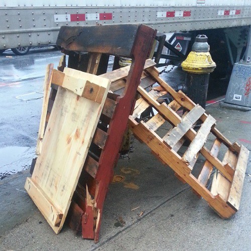

On the metropolitan museum of Art website, I searched up Japanese art. I found a drawing by an Japanese artist. The drawing has six objectives.The lines on the drawing are horizontal and diagonal. There is a lot of negative space on the drawing.The background shows Japanese characters. In this picture,there are opposite colors,red and blue. Red is one of the warm colors. Blue is one of the cool colors.The texture is implied because it is on screen.In the drawing, it looks like a beautiful, Japanese woman in a kimono. On her right side, it looks like she is holding an object. The pattern on her dress is a picture of the water and the trees.I wonder why the artist decided to draw this picture. It is true that Japanese woman wore kimonos in ancient times, but why would the artist have the woman holding a strange object. The object looks like a horn. I am interested in Japanese art because of how the artist draw different flowers or how they draw people in ancient times. This picture symbolizes beauty. A Japanese woman with long black hair and pale skin shows beauty in society.This picture was made during the Edo period, from 1615 through 1868. The culture is Japanese. The medium the artist used is a hanging scroll, ink, and color on paper.The artist name is kaigetsudō Ando. According to the philsopher Goodman, Realism is relative to the system of representation. This drawing can be real according to the time period.
a glass of wine please!... or a lonely grey flower with pebbles... I'm not really sure

I found this near the library that I go to. It looks like a glass of wine to me. Or it could me a weird flower with pebbles surrounding it. It's grey and the "pebbles" look like a dark shade of blue. At first it took me a while to notice if I can see anything. Then I saw some sort of glass that could contain red wine. I thought it was pretty cool. However it also occurred to me that it could be a grey flower. I'm not sure. What I find interesting is the spots around the figure. It stands out more and with the texture of the floor, it somehow makes the viewer focus more on the flower/ glass of wine. That's what I believe but again I could be wrong.
the mysterious floor

Floor 1: Untitled (Foyer of the Whitney Museum)
This picture really stood out to me. It reminded me a haunted mansion that would appear in most horror video games. The way it looks made me feel sort of creepy yet elegant. The gray coloring made it appear mysterious and almost like someone wants you to explore the area. The two staircases made me think that no matter which way you go you'll end up in the same place. The two sculptures on the wall complemented the scenery. The chandelier and I think it's a plant with a sculpture on the bottom tied up the whole picture. I loved it. I don't really have much to say about this other than it's beautiful and I want to physically visit this place.
Thursday, September 24, 2015
Intro
My name is Charlie, and the manner in which I'm posting these assignments probably says more than anything I can say to portray myself otherwise. While my racial background is Russian, I was born and raised in good ol' 'Murica. I'm a passionate person with no tangible passion, a hopeless romantic, and a lover of animals of all kinds. I'm an incredible amateur guitarist, artist, and poet. A humble dilettante if you will. Music is the key man. My favorite food (this is a difficult question to answer) as of last night is baked salmon with honey sriracha potatoes. Looking forward to this semester shared with y'all.


Tuesday, September 22, 2015
BP#3

This accidental piece, I am going to call, The Outdated
Pillar. I have given it this name because of how technology has improved for
MTA transit. This time post or pillar is
still used to tell people what time the bus is supposed to come. But since MTA
has had many complaints about it service, bus tracker apps have been created to
tell people exactly how many miles or minutes away the bus is from the bus
stop. I called it a pillar because that what is used as support, and this
fallen pillar was used as support for both the commuter and the MTA. This post
is in 3d and can be perceived as a sculpture. The piece does have a background
(foreground) the street in which it lays. The post is mainly made up of warm
colors and a pure color. The texture of the post is very rough, except for the
box with the time sheets (its made up of plastic). Because time has allowed us become more
advanced many things like the post will so start to become part of history
books. Growing up in the city seeing the post was like watching a rerun of your
favorite show or seeing a new episode of it. We knew what time the bus was
coming because we already looked at thousands of times before but every once in
awhile a new sheet would pull through. It was also one of the times when
talking to strangers was actually alright for me because we would talk about
how the sheets are not really a reliable source half the time or how crappy MTA
was. I don’t even do that anymore because I have a app that tells me when its
coming. One of the problems I have with technology, is that it takes us from
reality in a sense because we may be more connected but not in the right form.
But that is another story.
P.S. I DIDN’T REALLY
LOOK OUT FOR ACCIDENTAL ART BECAUSE I DON’T REALLY SEE IT MY ROUTINE, I FOUND
IT ON GOOGLE
BP#3 - Stripping Aesthetic Mistakes
What one person may see as an eyesore may very well be art to another. People's taste and style varies so tremendously. The picture I took exhibits that very point.


The most obvious visual element is the overlapping. You can see the order of the layers of paint, clearly due to the spacing. Most recently, there was blue paint but you can look closely and see the multiple layers that were there before. Space is present within those layers. The shaping is organic as a result of also indiscriminate scraping however the wood has been cut into geometric rectangle to outline the door frame. Additionally, those rectangular pieces repeat to accomplish the desired width and framing. Considering the frame, this could be regarded as a relief sculpture and therefore a 3D shape. The color present are all analogous; there are shades of blue, green and yellowish. Texture is also evident. All of the ridges in each coating, the grooves of the wood, the remnants of the scraping of paint on the wood and within the actually layers, the disturbance of the wood polish from the heating gun and the lines between the wood panels exhibit texture. With value, the contrast of the dark brown and black in the wood with much brighter coats of paint is there.
Seeing this reminds me of the past. How past occurrences accumulate on top of each other until the choice to remove them is made. But even when said decision is made, it's much more difficult to remove then to create. Much more time is spent reversing those mistake than is making them. Every coat of paint was a mistake, not only because of color choice but because of what lies underneath. There is this gorgeous natural wood, covered for years by these hues. Just as we often cover, layer, hide what is naturally beautiful within ourselves with these poor choices we make. I am imaging how hard the person removing this paint worked using a scraper, and heat gun and paint remover while each layer was applied with simple strokes of a paint roller.
Blog Post #3
Art is everywhere we look mostly because many see art in different ways, hence what we see as expressive and/or beautiful others may simply not. But I'd like to share what i saw just this Sunday while standing outside the church i go to, eating my bagel i look up and see what i think to be the most beautiful and artistic view.
 I title this 'sunshine'. In this i see a lot of complementary colors for example the blue and yellow so close together and the red dividing the green trees. As well as analogous colors such as the light blue and dark green. This scene just created an impressive image in my head and left me in awe. This picture couldn't fully capture the image i had witnessed because it isn't as bright as i had seen it and the resolution isn't quite as clear. Also the arrow the building has seems to create a better guidance to directing the eye upwards toward the sky. The reason i named it sunshine even though there wasn't much sun light was because of the yellow building making it feel sunny and cheery. The way i can describe it is as if we are imprisioned between buildings as if they were the walls keeping us from nature and looking up gives is a way of remembering the beauty hidden by the walls the buildings create. And lastly the idea that slowly we can see less of it because of the industries and corporations wanting to expand plus of the human waste we create and carelessly throw about gives this picture an even deeper and sense of beauty to me.
 I title this 'sunshine'. In this i see a lot of complementary colors for example the blue and yellow so close together and the red dividing the green trees. As well as analogous colors such as the light blue and dark green. This scene just created an impressive image in my head and left me in awe. This picture couldn't fully capture the image i had witnessed because it isn't as bright as i had seen it and the resolution isn't quite as clear. Also the arrow the building has seems to create a better guidance to directing the eye upwards toward the sky. The reason i named it sunshine even though there wasn't much sun light was because of the yellow building making it feel sunny and cheery. The way i can describe it is as if we are imprisioned between buildings as if they were the walls keeping us from nature and looking up gives is a way of remembering the beauty hidden by the walls the buildings create. And lastly the idea that slowly we can see less of it because of the industries and corporations wanting to expand plus of the human waste we create and carelessly throw about gives this picture an even deeper and sense of beauty to me.
Monday, September 21, 2015
blog post#3 The constraint of a generation

BP#3

BP #2 - Matsoso
It took me longer than anticipated to select a piece for this blog post. I went through all of the websites, numerous collections for well over an hour. Then, I saw this piece from Leonard Matsoso.
What I immediately noticed was the organic shape Matsoso created. This is true of the overall silhouette and the shaping within the figure. The angle from which he decided to depict this figure created a great deal of overlapping and space. Certain body parts are placed over others in creating this dancing figure. In doing so, Matsoso also has shown space. You can see which parts of the figure are in the foreground like the right leg and right hand, middle ground like the head, core and left leg and in the background like the leg hand.
When I came upon this artwork, I actually thought it was a sculpture. It could be because of my screen but I choose to site the amount of texture and surface quality for the reason for my assumption. The texture in this varies so and that is because of the line choices. "African Tribal Dance" by Matsoso is all about the lines. It is what makes the piece. There is a copious amount of lines in the figure and lines that make the outline of the figure. Value wise, there isn't huge contrast. The shades chosen depict depth but not in a drastic way. The colors chosen are the same; they don't have much contrast. Matsoso used different shades of the same color. It only ranges from a beige/tan to a darker brown.
Looking at this work, I see haunting, profound beauty and pain in the dancer's face. The way in which the face and head are cocked to the side, seemingly dangling and detaching from the rest of the body portrays the dedication it take to keep such an art form (tribal dance) alive. All of the parts of the dancer are contorted not only on the figure but within it's self. For instance, if you looking at one of the legs, you see that it comes from the hip in an an natural way and the leg itself has a knee that buckles in the opposite direction from where it should. This is to display transformation and departure from what we perceive as natural, normal or even beautiful. these organic shapes give off such a sense of hardness. Many parts even resemble actual rocks yet the muted colors give off softness. There is that juxtaposition which gives complexity. For something that appears so poignant and rough, the absence of black appears to redeem that harshness. Matsoso's piece visually striking, beautiful and powerful yet delicate.
P.S. - The screenshot doesn't do this piece justice. I tried to save it but it wasn't an option from the google art project, unfortunately. I

BP#2

This art piece was made Fredrick Mershimer, "Plymouth Street". He used mezzotint on paper for his medium. He inscribed "1990" on the lower right of the piece. There are a lot of cooler colors in the painting. Overlapping can be seen in the painting as well, the building structures (one in front of another). The lines for the bridge (the blue one) that can somewhat appear to be a horizon is made up of vertical, horizontal, and diagonal lines. I don’t really see any negative space within this painting. It only appears to be positive space (everything in the painting matters). One thing about the painting that I did not notice right away was that there are two bridges in it. Also there are train tracks, that have been cut off by the building and the sidewalk. I choose this specific piece of artwork because it appealed to me in the colors I enjoy and would predominantly wear in my life. It also reminds me of the city and how the street lamps and cars light it up without any sunlight being involved. There is life in the painting as well, the lights in the building could mean people or just one person is still in the building, or that the lights were just left on like some buildings. Mershimer also gave us a time (1990), which shows us what he saw in that year. The image he painted may not be here to today just as those trains tracks weren’t cut off prior to the making of the structures in the painting.
Blog Post #2
 I decided to search the Met website for a french revolution type of artwork i had seen about 2 years ago at the Met but i came across one that kind of revolved around the same theme but it caught my attention because i thought it has beautiful lighting. The oil on canvas is titled 'Louis-Marie, Vicomte de Noailles' by american artist Gilbert Stuart. In this artwork the one can plainly see the element of value. The artist chooses to create a frame around Noaillies by having the edges of the artwork be darker and therefore guiding the on looker to start of by seeing whats' on the middle ground of the scene and then having the eyes go from the lower right all around towards the upper right where it gets lighter so it can allow the viewer to drift off easily off the canvas. Also using the light areas the artist draws even more attention. For example the area around Noaillies feet is a much lighter color than the rest of the ground where they stand giving Noaillies a literal spotlight and therefore exalting and proving him to be the main subject. Also the white horse help direct the attention of the dark which mostly surrounds Noaillies. My interpretation of the artwork is that Noailles is a powerful war leader with class and finesse and very intellectual. It also appears as if he had recently finished or is begining some sort of battle and he stands brave,triumphant and unscathed.
Post 3

There is art all over the world. The world is art itself because of how human created it. Most things on earth all started from ideas and people who make ideas into reality. All the buildings, street, cars, and everything around us was based on someone's idea. They were thinking of designs to make a better life. When an artist see the world around them, they can get inspired to do many things because of their imagination and ideas they have. Everything will be art to them and anything can turn into art for them. For my accidental art I chose the table and its shadows. Even the table and the shadow of the table can be considered art because of the shapes and lighting. The table is a very simple object with a few shapes. There are also tables with unique shapes and has a lot of detail. The table is art itself if you look at it in an artist's point of view. They can come in many different shapes and sizes depending on how the artist transforms the simple table. Since the table is considered art, the shadow of the table is art as well. Shadows are the shape of an object from a source of light on the floor. They are art because you can see the shape of the table and its detail on the floor. If a table or object has this very unique design then the shadow will have the design as well. The shape of the shadow will never be the same if the source of light is the sun. Every moment the earth rotates so the shadow will move according to the sun ever so slightly. The shadow of the object will never be the same and I find that interesting because you will always see a new shape on the floor. That is how the earth itself is art.
Post 2
Technology/Transformation Wonder Women by Dana Birnbaum is a 2-D photography made in 1978. The video is about filmmaking in the early days and see how the visual and sound effects were. This movie is much different from what we are use to because of the time period and you can see a big difference on how new media changed the way we watched movies. Over many years you can see how the software editing evolved into something much more advanced. One big difference that this video and paintings and sculptures are different is that it’s moving pictures. This film isn't art that you paint but it’s an art that people perform. It has no paint and clay but a person acting out a script written by a writer. The writer uses words to express his idea instead of painting on paper. How the film was made is also very different from painting and sculpting. For performing art for a film you have to acted it out and take multiple scenes of the same part to find what is best. You have to do many scenes and edit it together into a movie. I decided to do this post on a film because I find films more interesting than a painting. Over the years you can see how much software and effects are improving as time goes on and that is very interesting what you are able to do with a computer. In my opinion a movie has more detail and more meaning than a pictures because of the way they film it. It’s a story that the writer wants you to know and experience for yourself and wants you to see his imagination in his eyes. I really like film and it really interests me when they act everything out and put it into a movie. The movie is the art and it’s showing you a story from someone’s unique point of view.
BP#2

It's a shape of "Bull's Head" and it's made out from just two objects which are bicycle's handlebars and seat, therefore, it lies in a 3D art. The light hit directly to the skull and it stands out more realistic and the colors of sculpture look brown and gray. Since this skull is made of plastic and metal the texture looks solid. During the world war, many millions of people were killed. This art played a vital role at war time because this art showed the transforming power of the human imagination at the time when human values were under siege. Thus, this bull's skull represents "Death Head". In my opinion, the artist simply did the unique art. To be honest, it's beyond my imagination, where he just used two pieces object to message the world about the effects of war I guess. I think he chose the brown and gray color because it represents decayed or rotten things and obviously the skull states death.

This is a sculpture by the artist Kara Walker called "The Subtlety" or "the Marvelous Sugar Baby" The idea for this piece surfaced after Walker was told that the factory was closing and that it would be a good place to build something because of all the history that the Domino Sugar Factory held. When she stepped into the massive space she noticed how the sugar was still clinging to the walls of all the walls and molasses was dripping from the ceiling. According to creativetime.org, Walker was known for problematic, discomforting, and unresolved images so of course her sculpture had to stand for something more than just a memory of the sugar that was once made there. The idea came from tons of research where she discovered that many african slaves were forced to work in this sugar factories. Many of them were children. The sculptures spoke about the story of slavery and the triangular trade. The giant sphinx like figure was made to resemble african american women; with their full lips, protruding uvulas, and big butts. The small figurines were made to look like the children that worked for these companies. They were made of a caramel like substance that melted while the exhibit was open. Walker liked how temporary it made it seem considering that the piece was very sight specific. The mini sculptures were also made to resemble the dripping molasses that came from the walls and ceiling. The sphinx was carved out of styrofoam and then coated in a mixture of sugar and water. This piece was meant to stand for so much more than just the remembering of the sugar factory. It was made to make us open our eyes and learn to look at the world in a new way. To end this post I thought I would leave you with some food for thought said by Kara Walker herself, “looking forward without any kind of deep historical feeling of connectedness is no good…She’s powerful… iconic in a way and she is so monumental, so unexpected, if I’ve done the job well then she gains her power by upsetting expectations one after the other.”
The princess

I
was with m friend, I call her my Princess, for she acts like one, but is most
humble. Her and I were just taking snaps, and i felt like this moment was
priceless. It says a lot about my personality, playful, expressive, and I just
LOVE cats. I believe that would be the main objective. Honestly to see
such a playful act brings me joy. As well as enjoy the female appearance. It is grace, femininity, just such a beautiful structure. I love the way her body correspond with cat features, as love as I love doing make -up. I had applied it upon her in which i wanted to to compliment her face, her style also in who she was. I thought the focus of the picture was necessary for the focus on her face but rather her angelic atmosphere. I chose this outfit because it was simple yet eye catching. There is a saying the label do not make the model but model makes the label. As for the environment it was most comfortable and suitable for showing comfort. The contrast in color in room of light eliminates the mode, of course making her the main focus. The textures are fine, sharp, yet soft and subtle. The brightness as well had brought out her skin tone and emphasized makeup.
1AM Stroll.

Untitled

As a personal interpretation of this painting is chaos. The separation of two beings, or just one being completely distorted. You feel and almost hear the screaming of this painting. Senselessness and imbalance of emotion is oh so clear. I feel it is the never ending pain of the artist. You see in his strokes, disorientation, almost bloody as well. Is it murder? Who knows, overall this is just such a powerful piece, that has left me breathless.
blog post#2
 I decided to use this artwork I came across in the Whitney Museum of American Art untitled by Berenice Abbott. I was randomly searching through exhibits that are displayed for this museum and this photograph grabbed my attention to just admire the beauty that shows some pictures look better in black and white.The visual element that caught my eye in the photograph is value. Berenice Abbott took this picture and transferred it to gelatin silver print. The light coming from the chandelier to following the flow of the stairs and meeting up to a vase. Because of the lighting slightly faded in the middle to reflecting off to the floor emphasizes the furniture. My opinion for this photo I believe has perfect proportion. The foreground which is the chandelier, middle ground the motion of the stairs giving a calm mood meeting the vase, and the background I will consider to be the sculpture where it may be a bit hidden from the shadow of the light. The exhibition may be flat but the placement and lighting give it depth. My impression of this picture gives off a vintage elegance type of vibe. Looking at the picture it reminds of how moderation came to change its style throughout time. I may not have existed in 1938 but I do get the sense of how it would be to be in a classical atmosphere.
The spills.

Come Away from Her

The form that we see in this piece is water color and Intaglio based. The predominant color base in this Contemporary painting is cool colors, very neutral not static. For the most visual elements is that the cool colors bring you to a solemn and yet peaceful outlook upon this art piece. The young melancholy female is in the foreground, with a black bird background. Within the horizon stand point is the middle ground. How everything is pulled together is by texture. The texture is light with brush strokes, but the watercolor gives the fluent, delicate but almost dramatic effect. This is a plain flat painting. There is no 3-d effect or realistic effect.
What you first see in this picture is the calm young girl. Your eyes move to the black birds which take equal amount space upon the paper, as the girl laying on the hill. What really pulls you all together is the cool pigments. The whole emotion of this piece, is intense,somber, but very much calm. The pale pink dress definitely gives the painting a pop. In the sense not everything is blended together. As for the direction of the piece is diagonal. With linear perspective, is very disproportionate. Light values, are dark, not necessarily dim. But that is the emotion that you feel. I believe that the concept of this painting is the consumption of young minds getting lost within nature, or being overly consumed within their minds. Even though you cannot see her eyes your imagination wonders what is her true expression, or what may be she pondering upon as she gazes as the birds fly away.
The Vine
 |
| Harriet Whitney Frishmuth |
This Sculpture called The vine shows a women stretching as if she herself is a vine.It was sculpted in the 1920s by Harriet Whitney Frishmuth. The sculpture is 3 dimensional the light hits it from above as she is leaning back reaching out like a vine. In the early twentieth century, sculptures of dancing women were producedthey were inspired by the success of dancers Isadora Duncan, Loïe Fuller, and Anna Pavlova. Frishmuth often turned to dancers for her the themes of these sculptures and paid these women to pose for her with dance poses. Just like in the picture taken of one shown, this statue balances on tiptoe in the middle of a performance, a grapevine suspended in her hands. Bunches of grapes lie at the her feet. The statue is made out of bronze though the metal looks old and weared out it adds the feeling of light from above. The artwork looks in motion the women is in mid dance leaning back all elegantly. "The idea of launching your body back, without seeing, is liberating but also terrifying" said by Francesca Harper, a dancer. I agree because the women looks liberated without a care in the world just like a vine, Growing and stretching. "One of the dancers said she held this pose for twenty-five minutes and, honestly, I don't know how anyone could do that" said by Thayer Tolles. That sounds painful but it shows the dedication to create these artworks.
BP #3 "Economy Stainless"

The colors in this photograph are dark, the once blue paint on the sheeting is cracking and beginning to rust. The dumpster in front of the building is brown with rust from years and years of use, as are the iron gates in front of the building. The white sign which was once new and bright is now rusty and old.
The cloudy, gloomy weather in the space surrounding this building adds to the run down, sad feeling of this picture. The closed gate in the foreground and background, along with the trash piled in the front gives the building a somewhat negative, neglected feel to it.
I took this picture this past weekend on a day that was a little chilly and gave me the feeling that summer was finally over. I decided I wanted to photograph something that reflected my melancholy feelings. When I pass this building I can't help but wonder how much longer it'll still be there, every few weeks something changes in this neighborhood so drastically that I think an old building like this surrounded by new buildings can in fact be considered a work of art.
Ballerina
 |
| The Dancing Ballerina |
When I edited this picture I wanted to show some visual elements which are Lines, shapes, space, warm color, Achromatic, and Value. As you can see here in this photograph I used a black and white color to show achromatic, but I brighten the red up to show warmth when you look at the photo. There are diagonal lines to show action of the dancing ballerina and horizontal line to show the calm feel of this photo. Value and space plays a huge role in this photography because the value gives my photo the light it needs to show what I want my audience to notice and the spaces which are negative (the background) and positive (the main object) gives my photo what it needs. I would say that my photography has texture because the positive space looks like you can feel that it may look smooth and there is also a pattern in the background the negative space that repeats a lot in this photo.
When some look at this photo they would only see paint on an elevator wall, but for other they might see a creature, an object, or a shape. I see a Ballerina, I have no clue of why, but I'm guessing it's because before I took this photo I read an article on Facebook about an African American Ballerina named Misty Copeland , on June 30, 2015, Copeland became the first African American woman to be promoted to principal dancer in American Ballet Theater 75-year history. As an African American female things like this would be hard to achieve, but her hard work and dedication overcame her obstacles and made her who she is now through what she love. I admire her achievement and hard work because it tells girls who are a different shade that they can achieve greatness no matter what. Misty Copeland way of art is through the motions of her body which is called Ballet and Ballet is a type of art.
This is Misty in art form:

Subscribe to:
Posts (Atom)